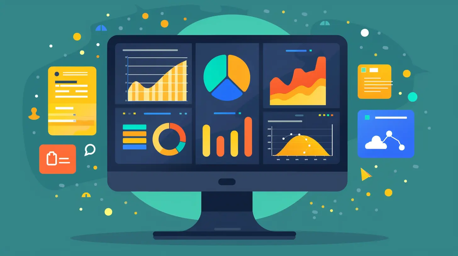
Simplifying Complex Data: How to Build Effective Dashboards
27 September 2025
Let's face it—data can be overwhelming.
In today’s digital world, we're bombarded with numbers, charts, and endless spreadsheets. But here’s the twist: data isn’t the problem. The real challenge? Making sense of it all in a way that actually helps you make decisions. That’s where effective dashboards come into play.
They’re like the car dashboard of your business—showing you just what you need to know, when you need to know it. No fluff, no confusion. Just clarity.
In this article, we’re going to dive into how you can simplify complex data through smart, strategic dashboards. Whether you’re a startup founder, a marketing manager, or just someone trying to make sense of their metrics, this one’s for you.
Why Dashboards Matter in a Data-Driven World
We live in a time where businesses generate more data in a day than they used to in an entire year. Sales, customer behavior, website traffic, social media engagement—it all turns into rows and rows of numbers.But data without direction is just noise.
Effective dashboards take that noise and turn it into music. They help you:
- Track performance at a glance
- Spot trends and red flags in real-time
- Make fast, data-backed decisions
- Communicate insights across teams
Imagine having a pilot flying without instruments. That’s what running a business without dashboards feels like.
Dashboards give your data a voice. And when built right, they speak volumes—clearly and simply.
Step #1: Know Your Audience
Here’s the golden rule before you even open your dashboard tool: know who you're building it for.Different teams care about different metrics. Your marketing team wants conversion rates, customer acquisition costs, and campaign performance. Your finance team? They’re glued to burn rates, margins, and runway.
📌 Tip: Tailor each dashboard for a specific role or team. Avoid the one-size-fits-all trap. The more focused it is, the more useful it becomes.
Ask yourself:
- Who will be using this dashboard daily?
- What decisions will this data influence?
- What metrics are truly mission-critical?
Understanding the "why" behind the dashboard will make every other step much easier.
Step #2: Define Clear Goals and KPIs
Let’s be honest—KPIs can feel like buzzwords if not done right. But they’re crucial in separating important data from useless clutter.Think of KPIs (Key Performance Indicators) as your business’s report card. They tell you how well you’re doing towards specific goals.
Examples of strong KPIs:
- Monthly Recurring Revenue (MRR)
- Customer Lifetime Value (CLV)
- Net Promoter Score (NPS)
- Website Conversion Rate
Don't overload your dashboard with every possible data point. Overwhelm kills clarity.
✅ Pro Tip: Stick to 5-10 KPIs per dashboard. It keeps the view digestible and focused.
Step #3: Choose the Right Data Sources
Your dashboards are only as good as the data behind them. Garbage in, garbage out.Pull data from reliable, real-time sources. Most popular dashboard tools like Tableau, Power BI, Looker Studio, and Klipfolio let you connect everything—from CRMs to Google Analytics, Shopify, and more.
What you want is a “single source of truth.”
Here's what to consider:
- Is the data up-to-date?
- Is it accurate and clean?
- Is it easy to integrate?
Having clean data is like cooking with fresh ingredients—you’ll taste the difference.
Step #4: Pick the Right Visualization Tools
Now comes the fun part—turning your numbers into visuals.But don’t get carried away with fancy charts just because they look cool. Remember: visual appeal is nothing without clarity.
Here are some simple guidelines:
- Use bar charts for comparing quantities
- Use line charts for tracking trends over time
- Use pie charts sparingly (they’re easy to misread)
- Use tables only when precision is essential
🤔 Think of your dashboard as a storybook, not a textbook. Every chart should tell a part of the story.
Also, be consistent in your visuals. Use the same color for the same metric across all dashboards. It builds visual familiarity and reduces the mental load for your users.
Step #5: Design with Simplicity in Mind
When it comes to dashboard design, less is always more.Don’t turn your dashboard into a Las Vegas slot machine. Avoid too many buttons, colors, widgets, or graphs. You want to reduce friction, not add to it.
Here’s a simple design checklist:
- Use whitespace generously
- Group related metrics together
- Align charts properly for a clean layout
- Label everything clearly and concisely
- Stick to a color palette that makes sense
And don’t forget about mobile responsiveness—especially if your users are decision-makers on the go.
🎯 Goal: If an executive can glance at your dashboard for 30 seconds and get the big picture—you’ve nailed it.
Step #6: Enable Interactivity (But Don’t Overdo It)
Drill-downs, filters, and real-time updates are awesome features—when used with purpose.Interactive dashboards let users explore data on their own terms. They can zoom in on specific timeframes, filter by region or product category, and dig deeper where it matters.
⚠️ Warning: Too many options can overwhelm and confuse users. Prioritize simplicity over flexibility.
Build interactions that add value, not noise. Think of them as optional side doors, not the main entrance.
Step #7: Refresh and Maintain Regularly
Dashboards aren’t a “set it and forget it” kind of thing.Your business evolves. So should your dashboards.
Schedule regular check-ins—monthly or quarterly—to:
- Remove outdated metrics
- Add new KPIs or views
- Fix broken data connections
- Adjust visual layout based on user feedback
Treat your dashboard like a living document. Keep it fresh and relevant.
Bonus Tip: Create a feedback loop with your dashboard users. Ask them what’s helpful, what’s confusing, and what’s missing. Iteration leads to excellence.
Common Mistakes to Avoid
Before we wrap this up, let’s talk about what not to do.Here are some dashboard pitfalls you should steer clear of:
- Showing vanity metrics (like page views without context)
- Using too many visuals on one screen
- Not explaining what each metric means
- Ignoring the needs of your end-user
- Forgetting to test across devices and browsers
Building a dashboard is like writing a headline—it should be clear, punchy, and instantly informative.
Tools That Can Help You Build Killer Dashboards
Feeling overwhelmed? Don’t worry. There are tons of tools out there that make dashboard creation a breeze—even if you’re not a data analyst.Here are a few to check out:
- Tableau: Great for deep analytics and clean visuals
- Power BI: Perfect for businesses already in Microsoft’s ecosystem
- Looker Studio (formerly Google Data Studio): Free and easy to use
- Klipfolio: Excellent for real-time dashboards
- Databox: Built for marketers and agencies
Pick the one that fits your team’s workflow and technical ability. Most of them offer templates to get you started fast.
When to Hire a Pro
Sometimes, the best dashboard is the one a pro builds for you.If you’re handling sensitive data, combining multiple data sources, or running complex analysis, a data consultant or business intelligence expert can save you hours (and headaches).
They’ll help with:
- Custom integrations
- Advanced KPI tracking
- Predictive analytics
- Visual storytelling
Think of it as investing in your business clarity. Because the right dashboard can drive big decisions—and big results.
Wrapping It Up
Dashboards are more than just pretty graphs on a screen. They’re your data’s voice, your team’s guidebook, and your decision-making compass, all rolled into one.By keeping your audience in mind, focusing on actionable metrics, and sticking to simple design principles, you can turn even the messiest data into meaningful stories.
If you build it right, people won’t just understand the numbers—they’ll act on them.
So, what are you waiting for?
Get out there and build dashboards that speak louder than spreadsheets.
all images in this post were generated using AI tools
Category:
Data AnalysisAuthor:

Caden Robinson
Discussion
rate this article
1 comments
Zephyrae Gilbert
Data made delightful, thank you!
October 1, 2025 at 4:43 AM

Caden Robinson
Thank you for your kind words! I'm glad you found the article helpful.


