How to Leverage Data Visualization to Make Informed Decisions
25 September 2025
Let’s face it—data is everywhere. It’s in your marketing dashboards, your spreadsheets, your revenue reports, and even your customer feedback emails. But raw data alone isn’t helpful. It’s like trying to find your way through a dense forest without a map. That’s where data visualization steps in.
Data visualization is your GPS in the chaotic wilderness of numbers and stats. When used the right way, it does more than just look pretty—it helps you take smarter, faster, and more confident actions in your business.
So, let’s dive deep into how to leverage data visualization to make informed decisions. Whether you’re a data nerd, a business owner, or just someone who wants to make sense of the madness, this post will guide you like a lighthouse in a storm.
Why Data Visualization Matters So Much
Before we get into the nitty-gritty, let’s talk about why this even matters.Imagine reading through 10 pages of raw numbers. Boring, right? Now, imagine seeing that same data transformed into a colorful chart showing clear trends, outliers, and patterns. Boom—clarity!
Data visualization helps you:
- Spot trends at a glance
- Identify problems before they blow up
- Communicate findings easily with others
- Make decisions based on facts, not intuition
You're not just prettying up spreadsheets. You're turning them into actionable insights.
The Brain Loves Visuals (And Here’s Why)
Our brains are wired to process visuals faster than text. In fact, 90% of the information sent to our brain is visual. That’s why infographics, charts, and dashboards resonate with people more than columns of numbers.Think of it like Netflix. Would you rather binge-watch a gripping documentary or read a 200-page report on the same topic? No contest.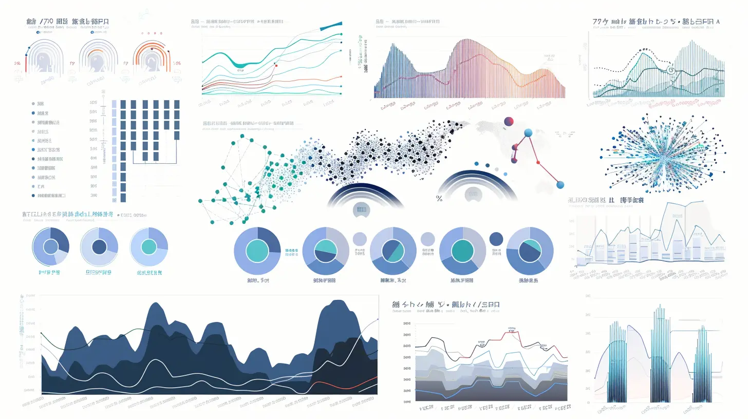
Types of Data Visualizations and When to Use Them
Not all charts are created equal. Choosing the right visualization can either make your point crystal clear or confuse everyone even more. Here’s a simple breakdown:1. Line Charts
Best for: Showing trends over time.Let’s say you want to track sales growth month over month. A line chart will let you see the climb (or dip) instantly.
2. Bar Charts
Best for: Comparing values side-by-side.If you want to stack up revenue by region or measure employee performance across departments, bar charts are gold.
3. Pie Charts
Best for: Showing portions of a whole.Don't overuse these—they can be misleading. But when used sparingly (e.g., showing how 100% of your budget splits across marketing, operations, and staffing), they work well.
4. Heat Maps
Best for: Spotting intensity or frequency.Heat maps show patterns, like website click behavior or sales by region. They’re like thermal goggles for your data.
5. Scatter Plots
Best for: Identifying relationships between variables.Want to know if more advertising spend leads to more leads? A scatter plot can tell you if there’s a correlation—or if you're throwing money into a black hole.
Tools That Make Data Visualization a Breeze
There’s no shame in using tools, especially when they make your life easier. Here are some top picks for creating eye-catching and effective visualizations:- Tableau – Robust, interactive dashboards
- Power BI – Great for teams using Microsoft products
- Google Data Studio – Free, easy integration with other Google tools
- Excel – Old but gold; great for quick, simple charts
- Looker – High-powered and customizable for data-savvy users
Each has its strengths, so go with what suits your data and your skill level.
How to Create Visualizations That Actually Drive Decisions
Alright, this part is crucial. It’s not only about making visuals—it’s about making decisions with them. Here’s how to do it right:1. Start With a Question
What are you trying to find out? Are sales dipping in one region? Are customers bouncing off one page more than any other?Clear questions lead to clear visualizations.
2. Choose the Right Data
You don’t need all the data—just the right data. Focus on what's relevant to your question. More data often means more confusion.3. Pick the Right Chart
Refer to the section above. Don’t use a pie chart for something that screams bar chart.4. Simplify, Simplify, Simplify
Don’t overload your charts. Use labels, colors, and legends wisely. One chart should tell one story—no more, no less.5. Tell the Story
What is this data really saying? Is your Instagram ad campaign killing it while your Facebook ROI tanks? Highlight that. Use arrows, colors, and annotations to make it obvious.6. Make It Interactive (If You Can)
Interactive dashboards let users dig deeper. They can sort, filter, and drill down without asking a data team every time. It’s like a self-service buffet of insights.Real-Life Use Cases: Making Smarter Moves with Visuals
Still on the fence about whether this stuff works? Check out these real-world examples:Marketing Campaigns
Data visualization lets marketers monitor ROI across platforms. A dashboard showing click-through rates, cost-per-click, and conversions in real time? That’s marketing magic.Sales Forecasting
Sales teams can use charts to see if they’re on track. Heat maps can show strong vs. weak regions, and line charts can highlight seasonal dips.Customer Service
A simple dashboard showing ticket volume, average resolution time, and satisfaction scores can help managers allocate resources and improve service.Product Development
Analytics from user behavior—like churn rates or feature usage—visualized in dashboards can help decide what to build next or what to ditch.Common Mistakes to Avoid Like the Plague
Not all charts are good charts. Here are rookie mistakes to dodge:- Using the wrong type of chart – Pie charts for everything? Please, no.
- Overloading with colors and text – Keep it readable
- Cherry-picking data – Dangerous and misleading
- Forgetting your audience – Executives want the “what,” analysts want the “why.” Customize accordingly.
- Not updating data – Outdated dashboards are worse than no dashboards.
The Future of Data Visualization: AI and Automation
Things are getting even cooler. Many tools now have AI-powered insights. You upload your data, and they suggest the best visuals automatically. It’s like having a data scientist in your back pocket.Automation can also keep dashboards live and updated in real time. No more manual reports at the end of the month. The future’s all about faster, better decisions.
Let’s Wrap It Up
Data visualization isn’t just for analysts anymore. With the right questions, the right tools, and a bit of creativity, anyone can turn data into insight and insight into action.Think of it as translating the language of data into stories everyone can understand. And when you tell a story well, people listen—and more importantly, they act.
So next time you're drowning in numbers, don’t panic. Grab your visualization toolbox, ask the right questions, and start mapping your data journey. Let the visuals guide you toward the answers you’re looking for.
Because at the end of the day, it’s not just about seeing the data—it’s about seeing through the data to what really matters.
all images in this post were generated using AI tools
Category:
Data AnalysisAuthor:

Caden Robinson
Discussion
rate this article
1 comments
Shania McClintock
Data visualization: because guessing is so last season. Get with the program, and let the numbers do the talking!
September 29, 2025 at 10:36 AM
Caden Robinson
Absolutely! Data visualization transforms raw data into clear insights, allowing us to make informed decisions rather than relying on assumptions. Let's embrace the power of numbers!